Wednesday, January 16, 2019


Worst Website #2


Yahoo.com one of the most popular pages for emails has one of the most terrible designed websites. Yahoo has so much content on the homepage, that when visiting the unorganized page mashed up with articles just thrown into your face. Also, the when listing news articles the grouping of topics into section is terrible. The heading is made very miniscule and are not organized lacking any structure.
Moreover, the ads present throughout the page by different sponsors feels more like a retail website than a service website. Lastly, better format for the homepage and UI design will help enhance the experience for the user. 

Worst Website: #1


Wikipedia.com is the largest information website with a vast knowledge that allows people to edit and add new information to a wide array of topics. Although, Wikipedia hold a great amount of information the design of the webpage is bland and with a small tab view on the right side that is linked to internal webpages. The topics of information is all jumbled up together at the top of website.
The website ultimately, lack structure besides the tabs on the right the webpage when looking up topics refers to other webpages.

Best Website: #3


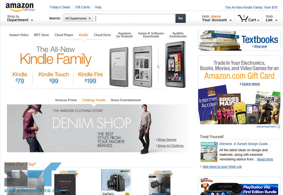
Amazon, one of the largest online retailer for almost anything you could possibly think of has one of the greatest website design. As soon as the website loads you  are started off with the deal of the day that is shown in a card based design with bold color.
 Moreover, the search bar is easily identifiable where a person can find anything they desire to purchase. The purchase system is very simplistic with an amazing tracking system that allows people to look at their orders and their purchase history. Amazon is the modern day Walmart just online.


Tuesday, January 15, 2019


Best Website: #2


Codecademy is one of the greatest interface websites because of the simplicity and card based design that it holds. Obviously, the website has a great design because the website helps people learn how to code. Languages like html, CSS, JavaScript and more. The interface allows a coding experience for with an onsite coding and debugging mode. This website utilizes bold colors that allows the multi-level tabs to contrast from the simple but elegant white background. 
Moreover, the vast array of topics creates a never-ending learning experience for the user that is all explained and practiced through their interactive website. 

Best Website: #1


What features make a website appealing is it the contrasting choice of bold colors such as bright red or minimalistic design of just a single logo with tabs that section off a user’s choice. YouTube is the second most popular website up to date. Why? It's simple, the content provides through YouTube's service from "you-tubers" not only allows people to connect to others, but the process of connecting through a simple process in a couple of clicks allows the user to experience a personalized view that no two people could view. All viewers are bombarded with their own recommendations of recent listing. This creates a personalized view for each individual creating a self-experience. Although the Ads are a little painful but, they are sometimes skip-able. Also, integration of a dark mode allows the use without constraining the eyes. The user can sign in and subscribe to channels that they watch and want updates from. The subscriptions are all present on the side with numbers representing new videos released. YouTube has a great simplistic design that allows people to watch current events, learn, and just enjoy.  


Worst Website #2 Yahoo.com one of the most popular pages for emails has one of the most terrible designed websites. Yahoo has so muc...